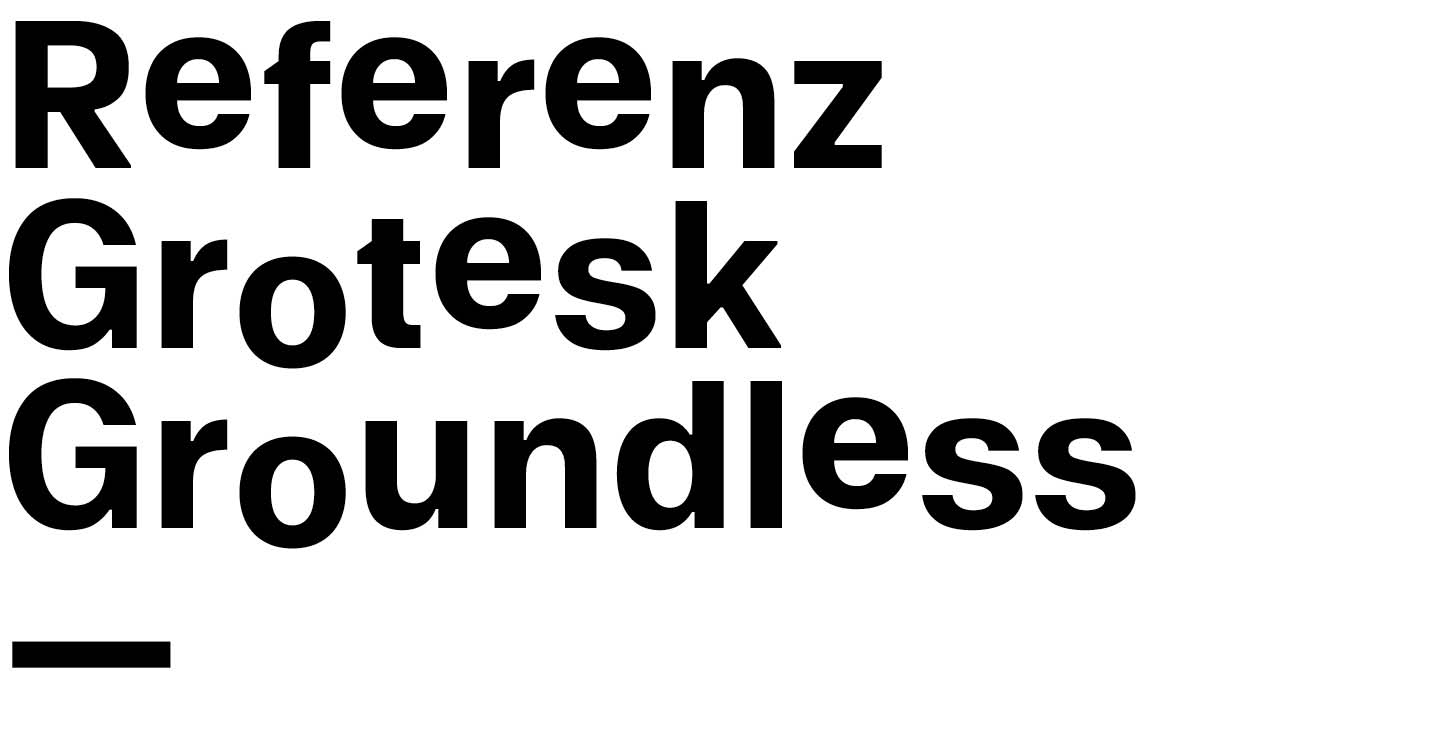
Referenz Grotesk Groundless
In collaboration with Stefanie Schwarz
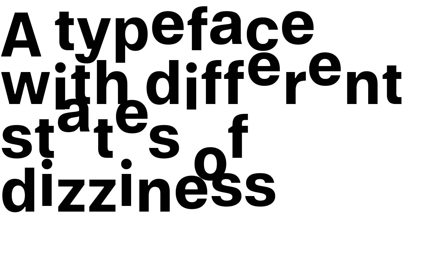
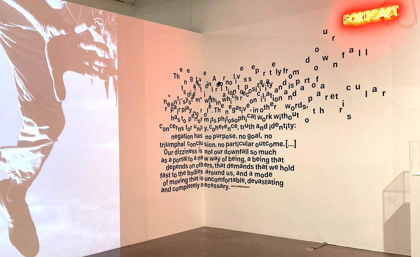
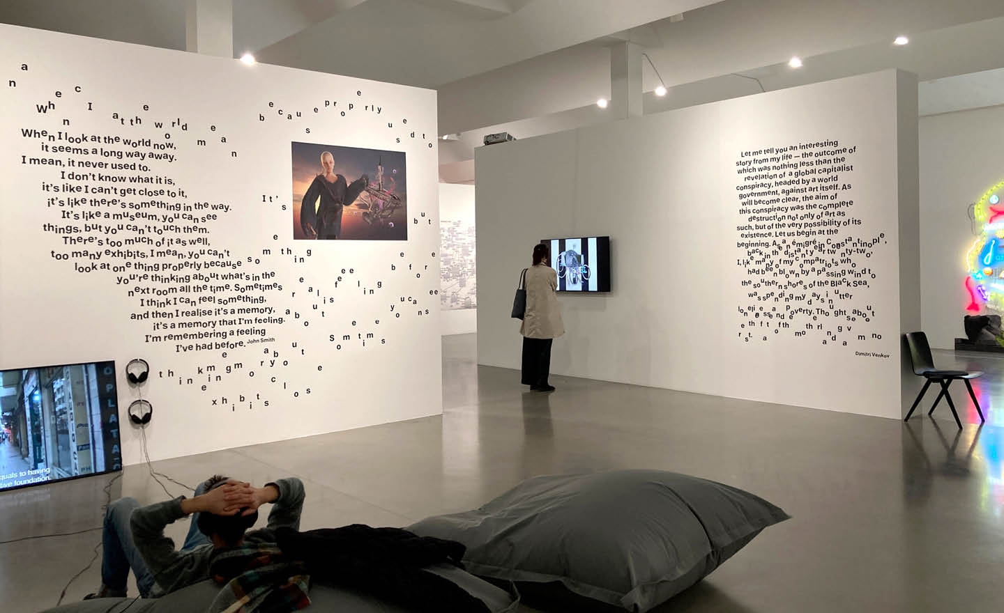
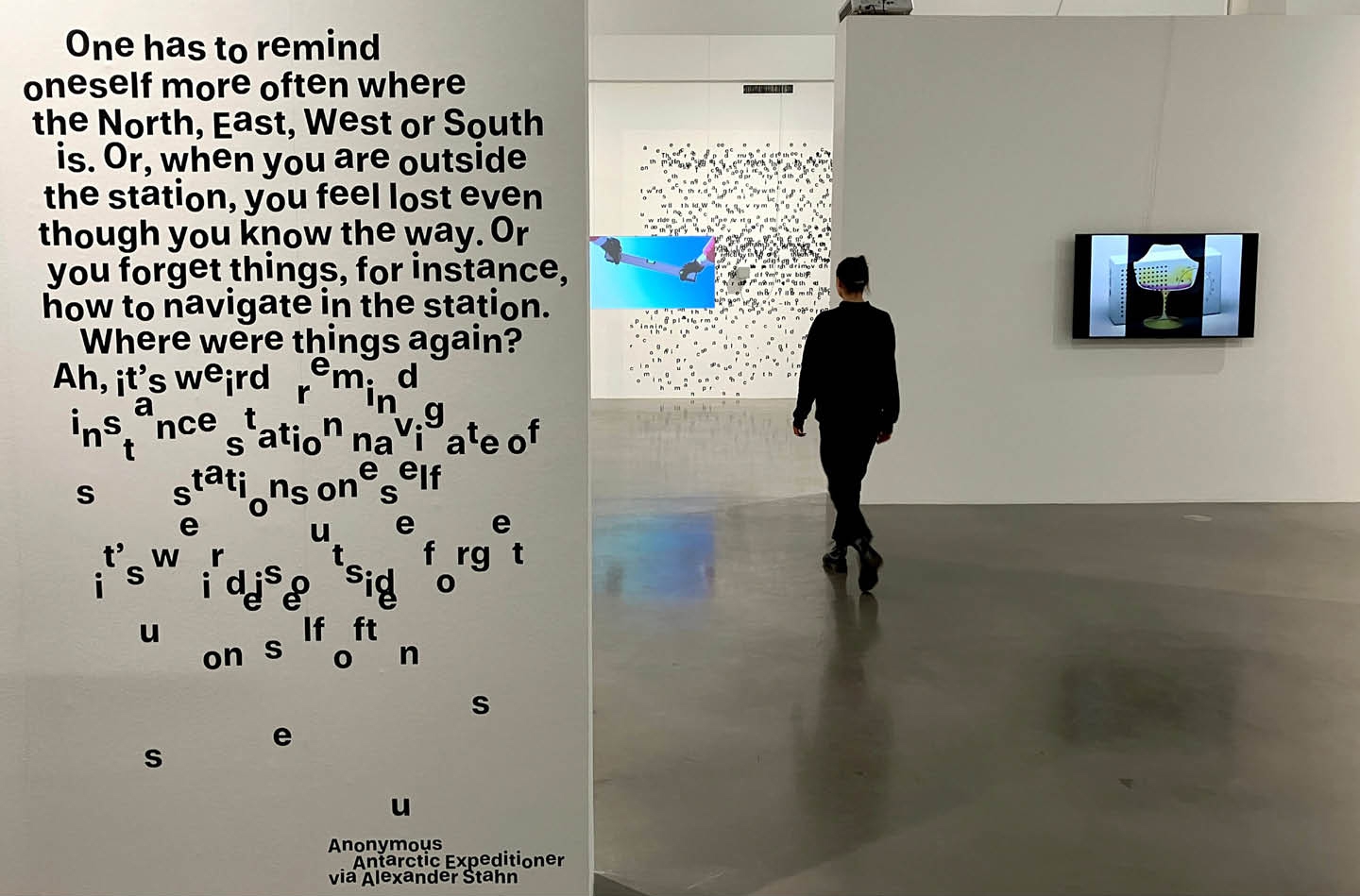
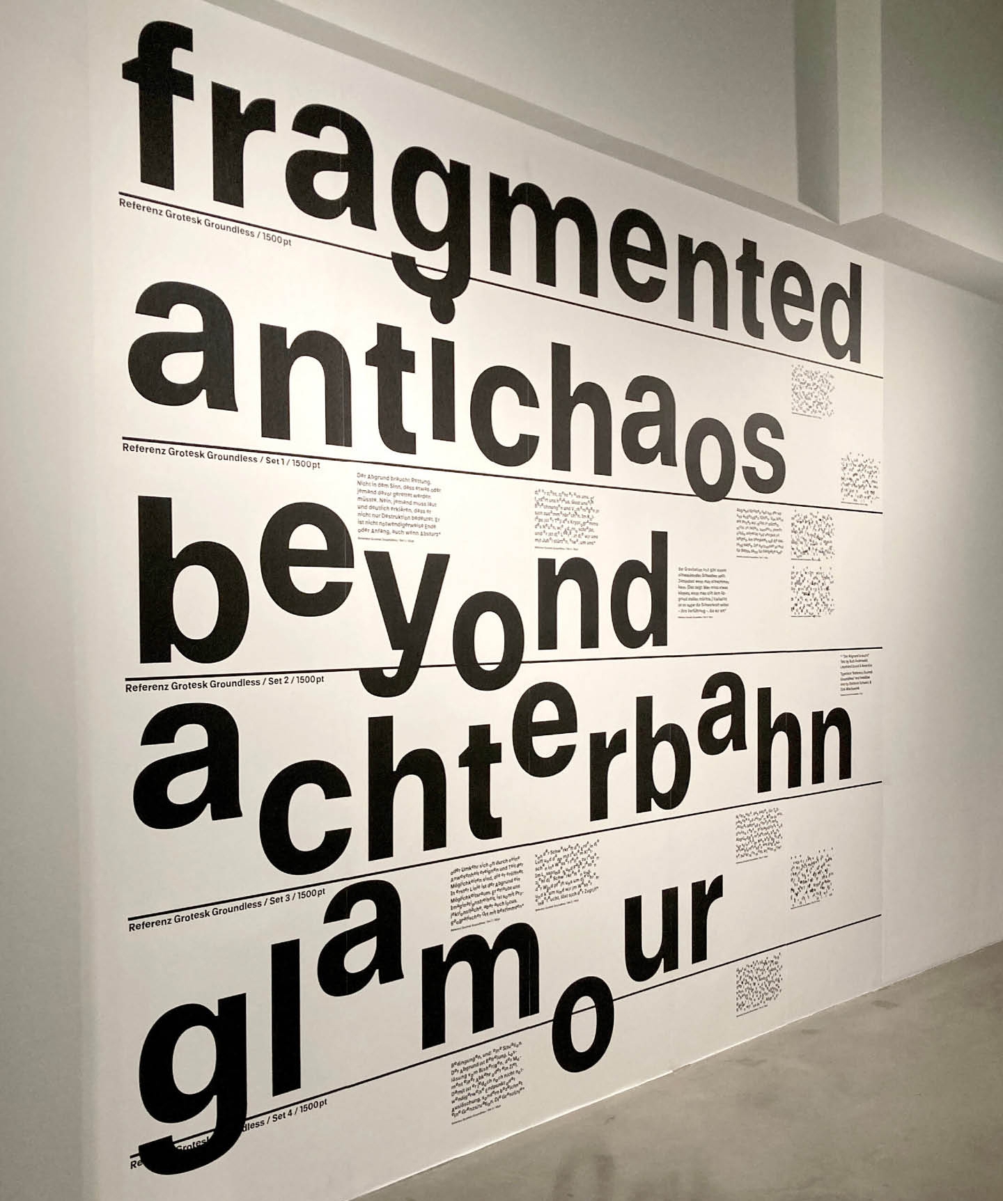
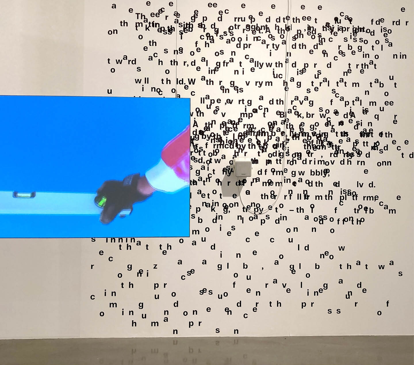
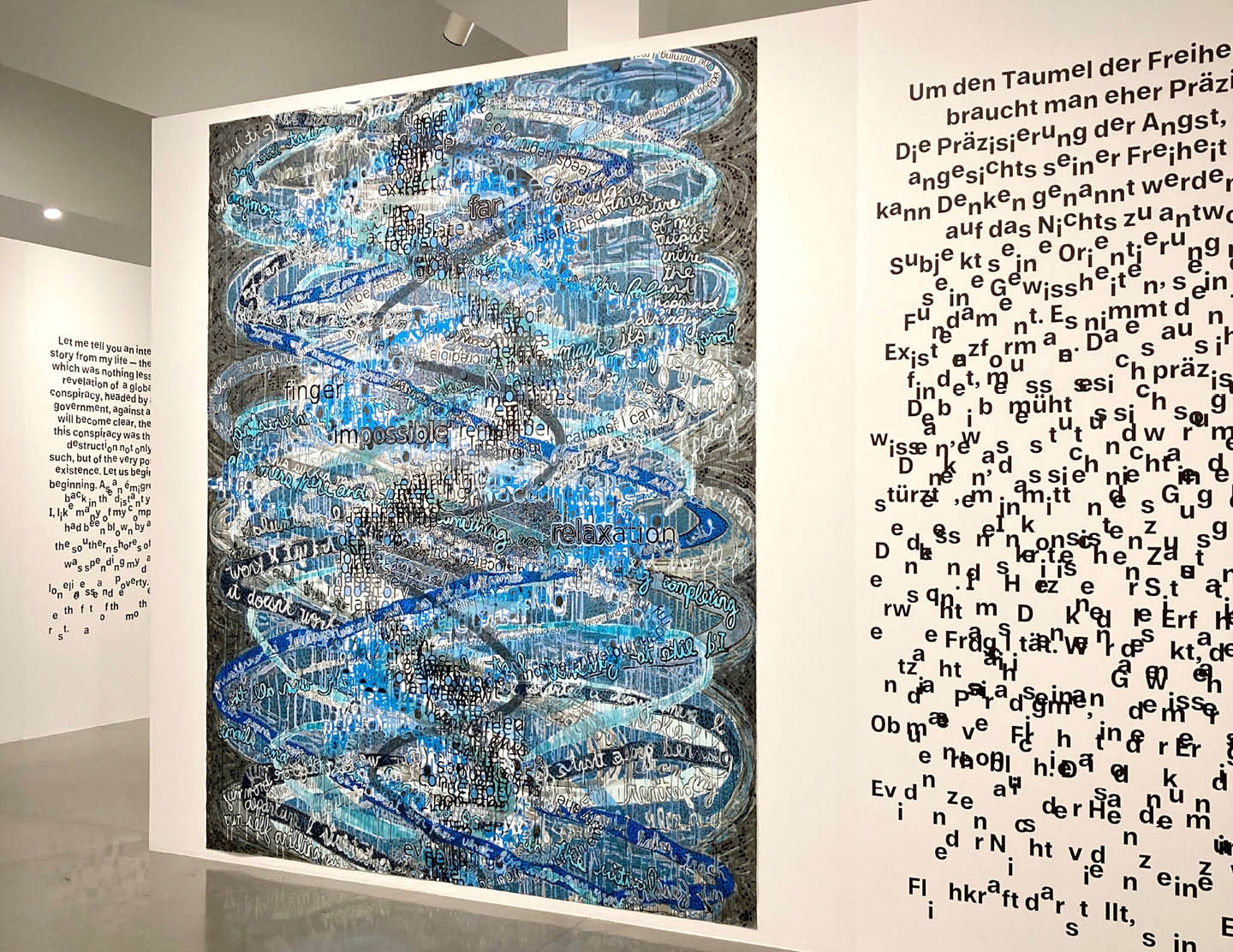
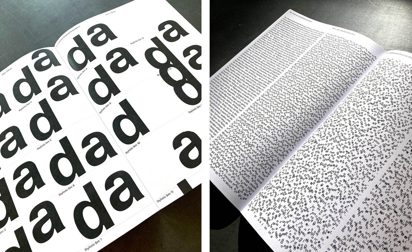
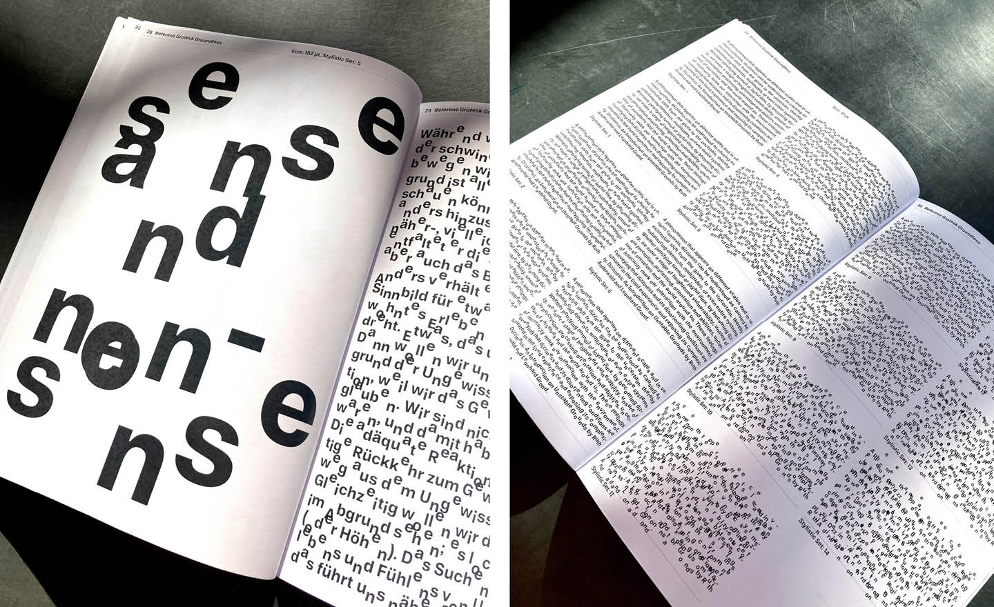
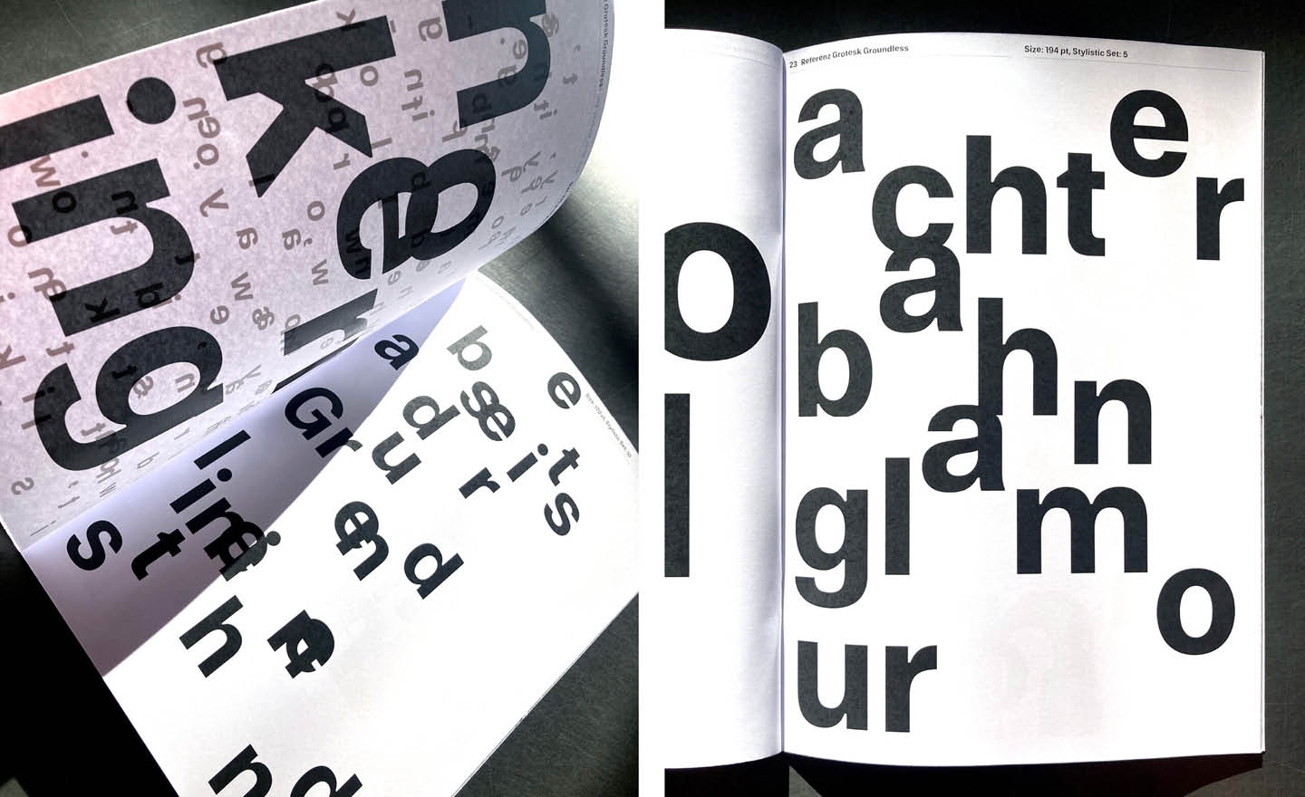
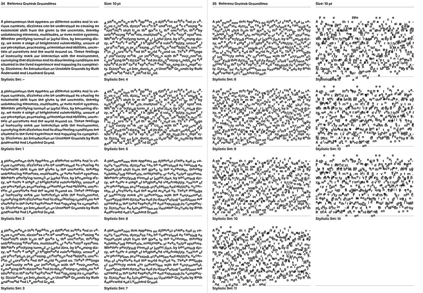
Referenz Grotesk Groundless has been designed for the research and exhibition project “Iliggocene – The Age of Dizziness” at KINDL – Centre for Contemporary Art in Berlin. In the beginning we have been asking how dizziness can be translated to the field of typography and type design. Can a typeface make us dizzy and provoke a feeling of disorientation by interfering with the reading flow? By spinning, slanting and shifting letterforms to different extents, we have been testing various types of disruptions. Finally we’ve decided for a simple but quite effective method: the baseline shift. By doing so we’ve created a type system with different states of dizziness via letters that shift from their baseline at different levels.
The new font is based on our type family Referenz Grotesk and now expanded by a dizzying extension, with 15 grades of dizziness, including 140 dizzy characters. Referenz Grotesk Groundless transforms – gradually or at once – readable text to an unreadable typographic structure, challenges readers that find themselves between dis- and reorientation.